Minimal theme by EasyStore - Candy
By Yavini Lucille · 20th March, 2020
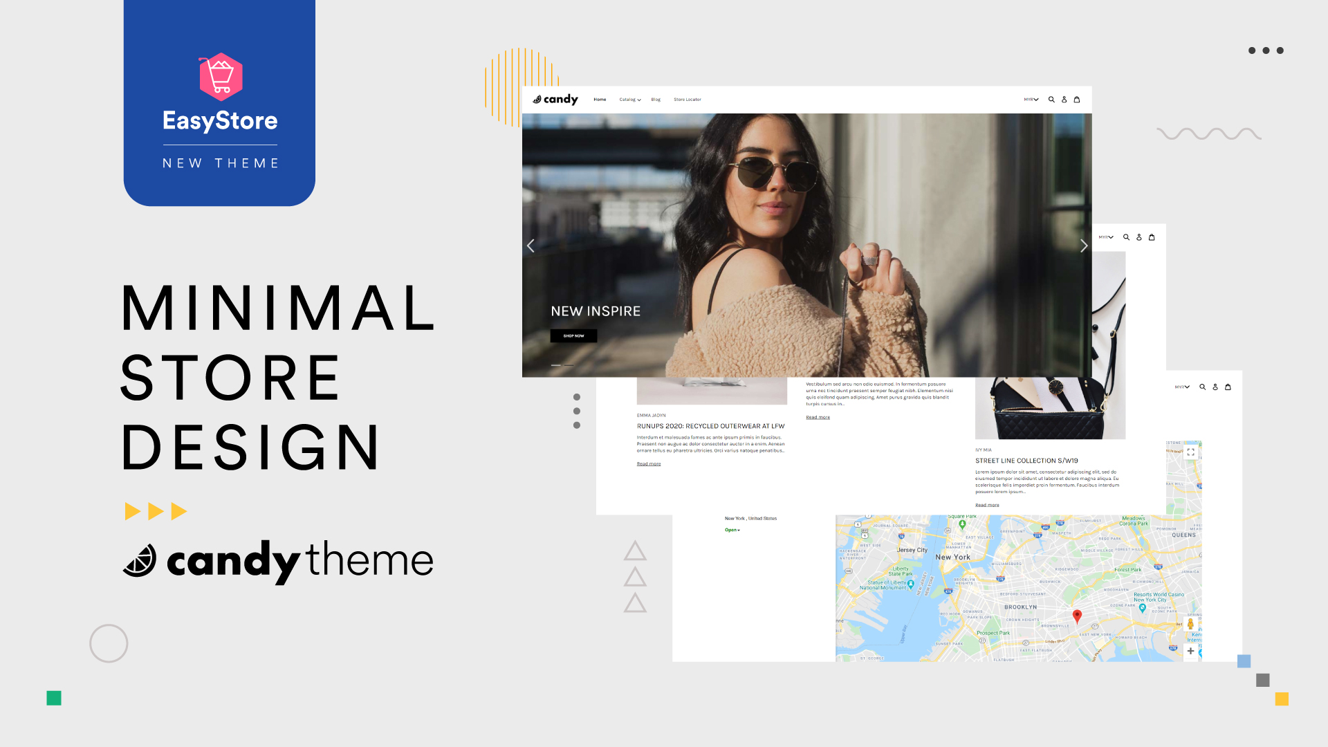
Before validating a business idea, you might have a try to sell it online via social media or marketplaces in which the layout is fixed, no different from each other.
“Content is king” starts to be the recent topic and minimalist theme has taken the world by storm lately. Visitors not only look into the product value but also emphasize on the whole written content that shines the work.
A theme with a small amount of effort comes together much decoration -- the goal of minimal theme design website to operate “less is more” design philosophy.
Here we bring you a minimalist theme -- Candy to simplifying your website design with necessary elements in a splendid way. Take your website to a new height by designing it with this theme.
Essential Tips of Minimalist Theme In My Web Design
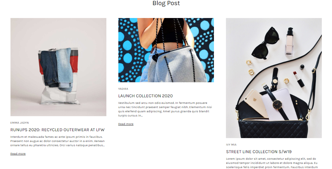
Essential 1: New Layout Option - Blog post section
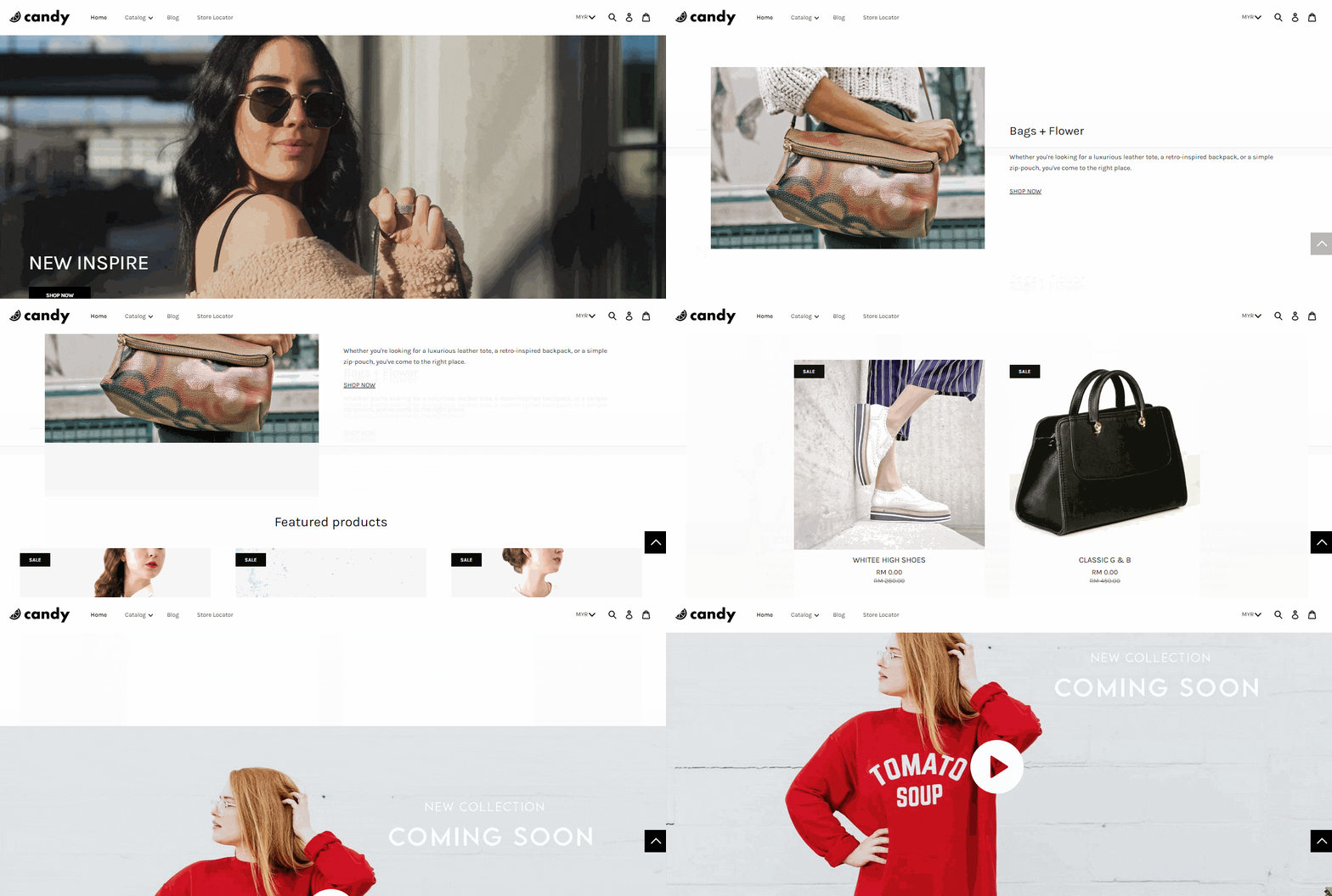
Highlight your thoughts and images on the main homepage to serve the visitors with rich information about the brand. The blog post section has been designed to keep visitors engaged with your minimalist page by delivering useful content.
It features an image (as the banner of the blog) and headlines along with the preview text for each blog post. No need another link to direct visitors and yes, they can get your brand story at a glance. Save time, straight to the point.
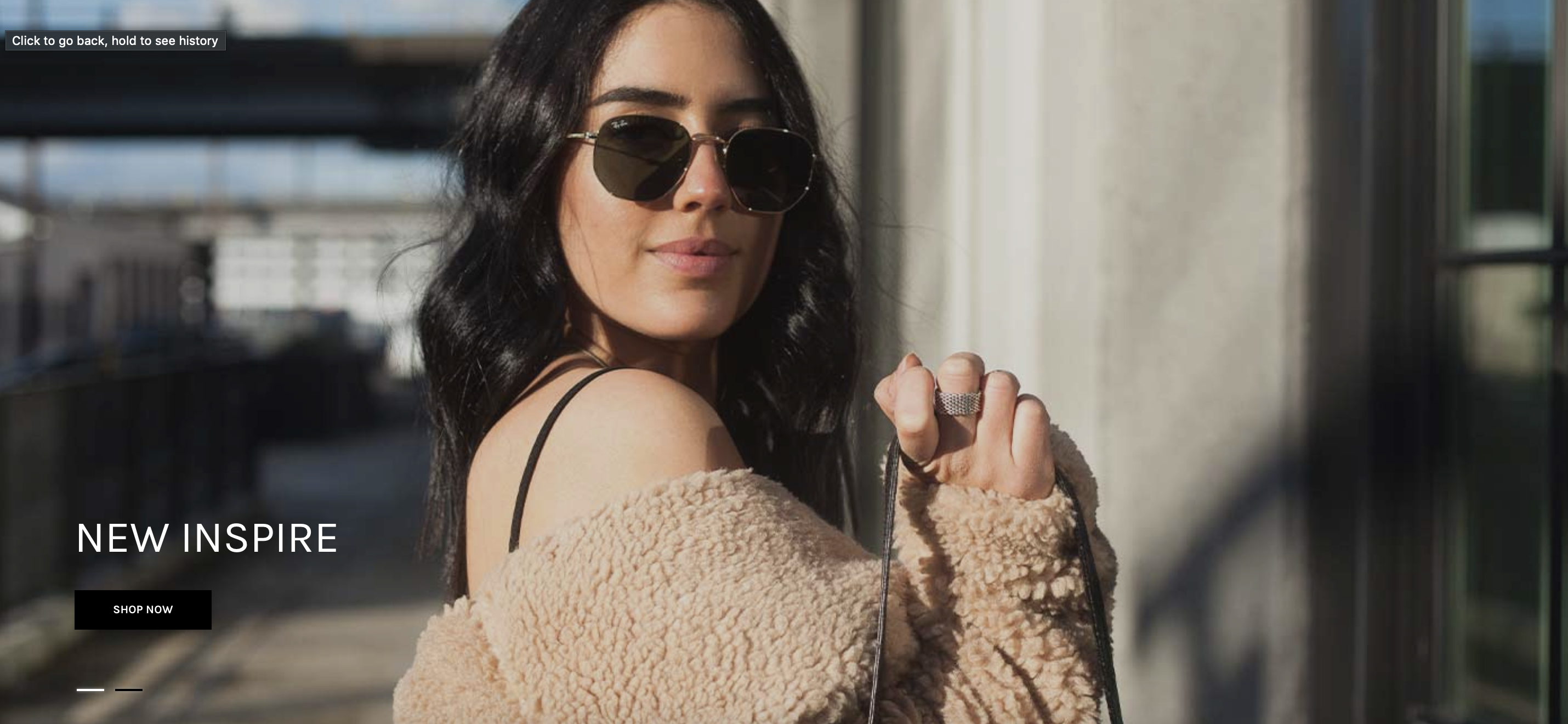
Essential 2: Restyled Slider
When it comes to minimalist, we’ll reply on as minimal written content as possible and as simplest design as possible. Lean but stylish.
The title and its CTA is moved from the center to the lower left side to convey the main idea of the brand or the visual narrative of the site. It implies the visitors to focus on the key points of the images showcased.
Essential 3: Enriched Product Display Structure
The homepage is built with new composition of image and text where it never appears in EasyStore before.
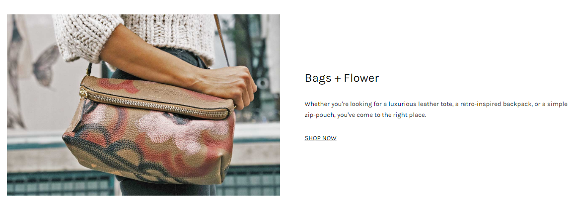
i) Refashion Highlighted Product with Customizable Overview
What makes this new layout section outstanding from EasyStore themes? An introduction of the brand idea is presented on the main menu of the site.
Fully explain the product as well as the company. Feature image can either excite your visitors or turn them away since it forms the very first impression in convincing them to look further.
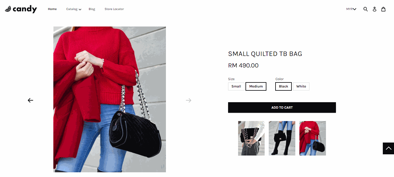
ii) An Easy-To-Access Shopping Cart with ‘Add To Cart’ Button
Beyond the product images, a high level of product information must be given to right off the bat. Grab the consumer attention immediately to the ‘Add To Cart’ button.
Instead of heavy texts, this theme designs a product-page-like section where you can directly place the order to the shopping cart by remaining on the same page.
The newly launched cart drawer has a wider picture on the shopping cart with details of products. Replacing the right side shopping cart to make sure the ‘checkout’ button is always visible for your consumers making purchases.
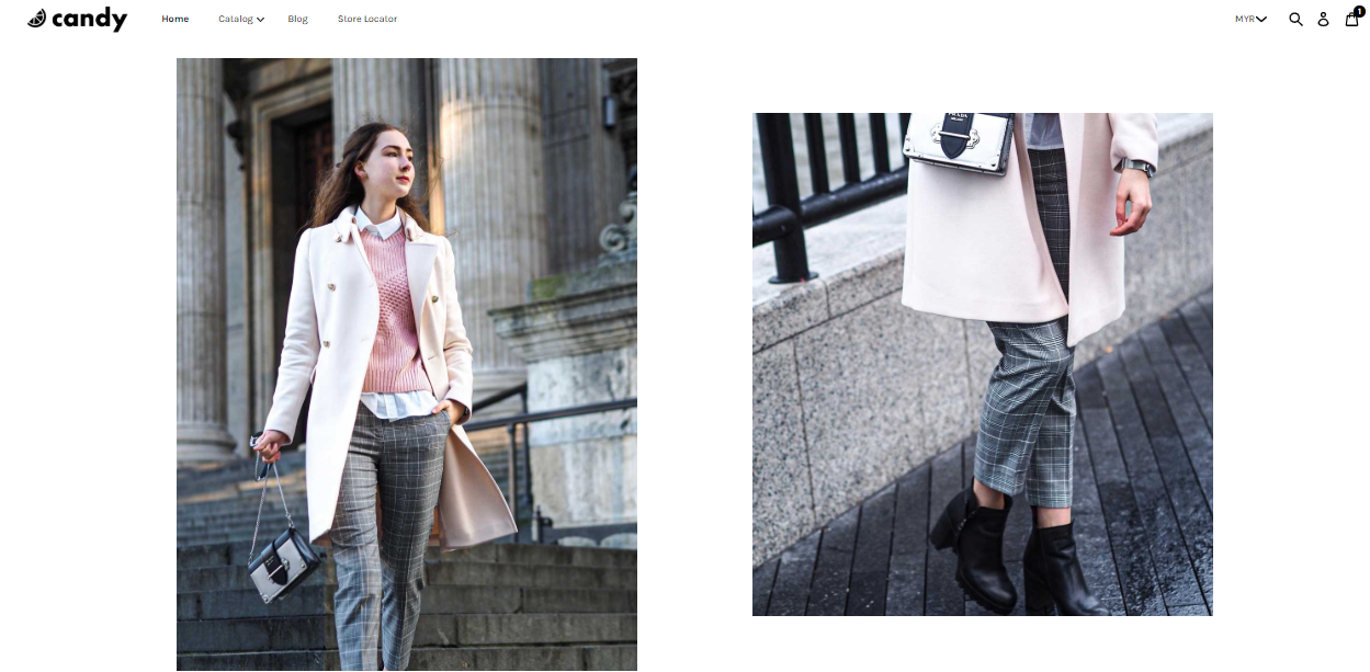
iii) Show Related & Recommended Products with No Description
Of course, people ain’t go out with just a piece of clothes. They need a pair of shoes, a suitable bag, and even some accessories to complete their fashion.
This theme perfectly displays the products that they might interest without linking them to another product page on the homepage. By keeping the page on your product, its visual element has the power to gain the conversion rate as a result of the clickable image.
Since the visitors are on the same page, they might get cross-selling to the related products offered by the brand and continued to the checkout.
Essential 4: Incorporate Video into your Website
As we have introduced X-Force theme before, it is the second theme that allows you to insert YouTube video on a website. However, unlike the previous theme, the Candy theme provides the freedom to display the video other than only in the slider.
You can make an explainer video to live up concepts or demonstrate complex ideas by giving a shortcut to get the heart of your offerings instantly for visitors. It’s also the easiest way to engage since people love to watch rather than read, isn’t it?
Beauty in Simplicity
Minimalism has always performed the simplest way to display the information. However, it gives a challenging task to design an effective website while offering professional outcomes with its limited minimalist design.
Eliminate unnecessary excess and witness how the timeless design concept impacts your brand.
最新文章
-

March 2025 Product Updates
By Cavan Koh · 9th Mar, 2025
-

How These Retailers Use UCX to Prepare for Ramadan—and Keep Customers Coming Back
By Frost Chen, Poh Sook Yan · 2nd Mar, 2025
-
1,000 SMEs to Benefit: EasyStore and Partners Sign MoU to Empower Unified Customer Experience (UCX) for Retail and Ecommerce
By EasyStore Press · 26th Feb, 2025
-
Let Business Help Business Supports Over 1000 Local SMEs Across Malaysia
By Amirul Asraf · 15th Feb, 2025
-
EasyStore Launches Brand App: A Game-Changer For Customer Experience
By Kelie Wong · 13th Feb, 2025
-

February 2025 Product Updates
By Cavan Koh · 9th Feb, 2025