5 Tips for Effective Ecommerce Call-to-Action
By Thara Sofian · 17th November, 2014

This blog was updated on 10 March 2025, for more information connect with our team: https://www.easystore.co/contact
When it comes to ecommerce, there is one thing that plays just as an important role in increasing conversion rate, as anything else ; effective call-to-action (CTA). Unfortunately, this very small detail is often left neglected, losing many companies the chances of getting thousand of dollars of extra revenue. There's no exact formula for the perfect ecommerce CTA, but there are some aspects that web designers should focus on tweaking and testing to make sure they’re maximising their conversion rate.
1. Wording
Choose the correct wording for your CTA that is not only simple and clear, but also inject a sense of urgency to entice the user into taking a particular course of action.
Tip: An effective call to action is between 2 to 5 words, i.e. SHOP NOW, GET STARTED, DOWNLOAD YOUR EBOOK TODAY, ADD TO BASKET, GET COUPON CODE.
2. Color
Ideally the CTA needs to "pop-out", so it should be an eye-catching colour that doesn't blend in with the rest of the page.

Tip: Choose bright colors, i.e. yellow, red or neon green.
3. Size
People don't want to go around searching for that click-to-action button. If they can't find it, they'll move on. So the CTA should be big enough that your customers can spot it straight away.

Tip: Besides making the button big enough for customers to spot, the shape of the button isn't necessarily rectangular. It could also be round, so long it is noticeable.
4. Multiple
While it's not a good idea to fill your page with CTAs in the hope that the more there are the more sales you'll make, there is scope to have multiple of CTAs if you have a large or complex page layout. This makes it more convenient for the user where the page contains sub-sections or different features that might draw their attention from the original CTA.
Tip: Place your CTA at the top, centre and the bottom of the page, if your page content is lengthy.
5. Test
Last but not least, the only way to find out the best combination of factors for your CTA is to test each one to see the impact versus a control. Running A/B tests is relatively simple and is a great way of validating or disproving your hunches.

Make Customers Love Buying From You
EasyStore empowers your brand to prioritize customers and enhance their experience, creating a unified customer experience (UCX) that makes customers love buying from you.
Over 50,000 brands have grown their businesses by embracing unified customer experiences (UCX) strategy through EasyStore across multiple sales channels - online store, retail outlets, marketplaces, and social media, ensuring consistency in product and service offerings for a seamless shopping journey.
Embrace UCX and redefine your business success today
Discover how UCX can elevate your customer engagement with a truly unified journey for your customers, streamline operations, and drive growth across all channels.
Contact UsLatest articles
-

March 2025 Product Updates
By Cavan Koh · 9th Mar, 2025
-

How These Retailers Use UCX to Prepare for Ramadan—and Keep Customers Coming Back
By Frost Chen, Poh Sook Yan · 2nd Mar, 2025
-
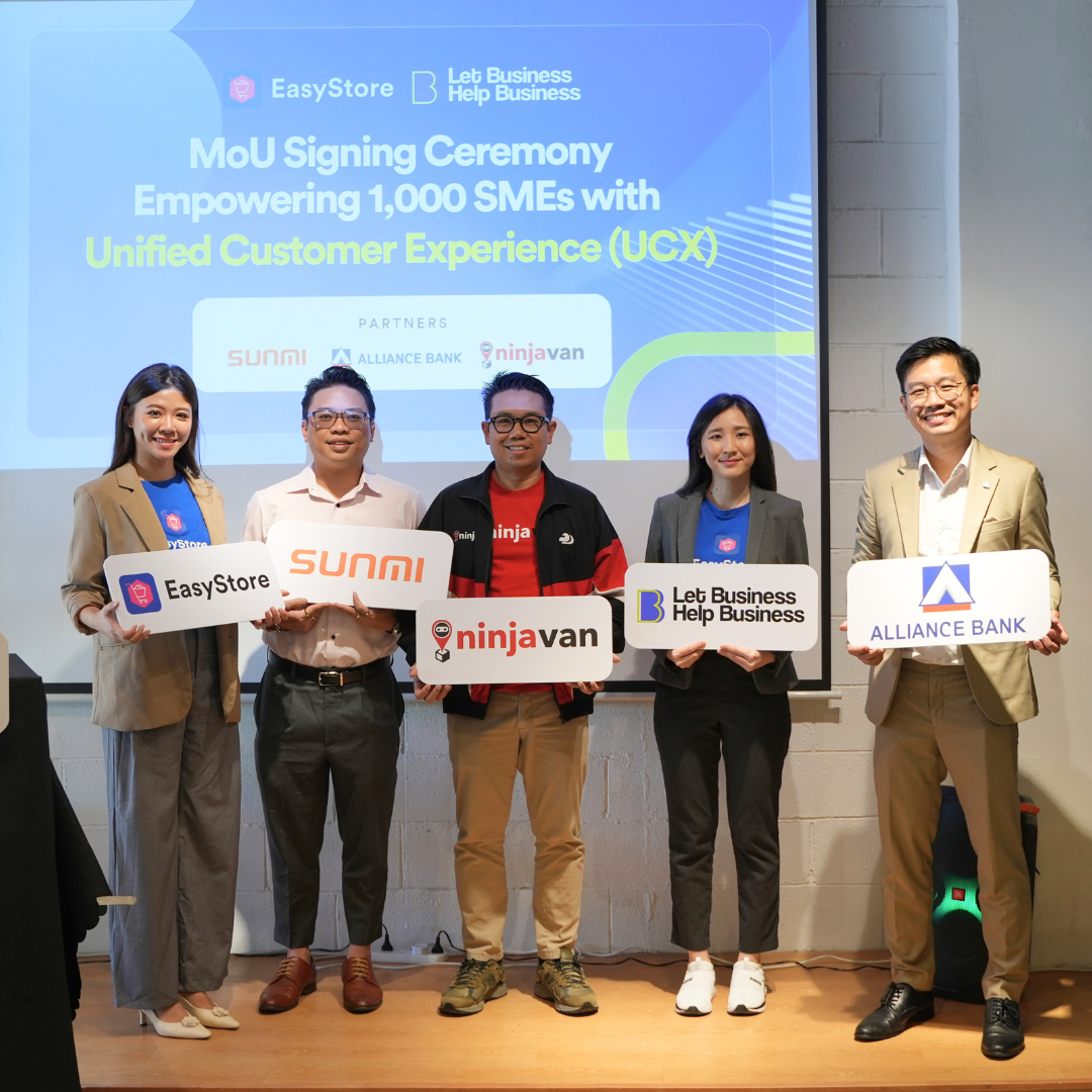
1,000 SMEs to Benefit: EasyStore and Partners Sign MoU to Empower Unified Customer Experience (UCX) for Retail and Ecommerce
By EasyStore Press · 26th Feb, 2025
-

Let Business Help Business Supports Over 1000 Local SMEs Across Malaysia
By Amirul Asraf · 15th Feb, 2025
-
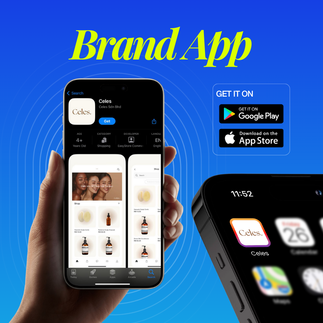
EasyStore Launches Brand App: A Game-Changer For Customer Experience
By Kelie Wong · 13th Feb, 2025
-

February 2025 Product Updates
By Cavan Koh · 9th Feb, 2025