The Story of the Nike Logo Creation
By Anna from Logaster · 27th August, 2019
The Story of the Nike Logo Creation
Creating one logo can be a whole story! At least, this is exactly what happened with Nike, a brand name of which is now known worldwide and needs no introduction. But at the beginning, the brand’s founder, Phil Knight, was very doubtful about its effectiveness. Today, “swoosh” is one of the most memorable signs, and a real role model!
The Meaning of the Logo
Any brand starts with its name. “Nike” was named after the Greek goddess Nike, who once visited Jeff Johnson’s dream, who was Phil’s Knight colleague.
In the Greek pantheon the goddess Nike is the patroness of victory, so she became the personification of the entire brand. And at the same time, she helped to determine what the basis of future brand design will be: determination, speed and confident achievement of goals.
The Story of Creation
The basis for the future “swoosh” was the movement and image of the goddess Nike, who the company was named after. But there were some difficulties with its embodiment: the work of professional designers did not satisfy Phil Knight. Then Phil decided to ask Carolyn Davidson for help, whom he had met at Portland University: it was she who helped him with design at a time when the businessman was just starting his business.
Thus began the history of the Nike logo.
Who Came up with a Logo
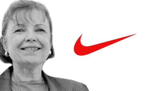
Phil Knight accidentally found out that Carolyn needed money to pay for painting courses. And then he offered her to create a logo for him for $ 2 per hour. The girl took up the creation of a brand name that would reflect the essence of the company and at the same time emphasize its uniqueness.
Carolyn's pen connected two curves, on the basis of which she developed several sketches. The girl immediately liked this image: it seemed to be dynamic and in constant motion.
Phil's colleagues and partners liked the design and so it became corporate, and Carolyn Davidson received $ 35 for 17.5 hours of work spent on development. So the young student became the creator of the legendary symbol.
But the reward of a talented girl did not end there. In 1983, when the young brand had already gained popularity, Phil Knight organized a party in honor of Carolyn, gave her a golden ring with a “swoosh” and shares that cost $ 1.5 million today!
The Main Logo Design Elements
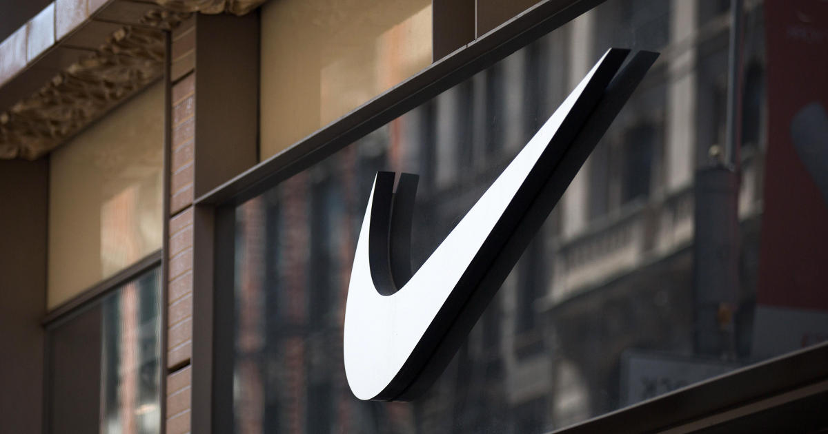
Today the Nike sign is a benchmark for a successful and thoughtful design solution that meets all trends and at the same time has a classic form that is applicable at all times.
Shape
The icon is two connected curves forming a stretched forward tick. This shape perfectly expresses the movement somehow reminds of a boomerang, while its rounded bends always look favorably on shoes and products. Also, the tick expresses the desire to achieve the goals set, which was perfectly emphasized by the company's slogan “Just do it!”.
Color
Each model of company’s corporate production differs: they have different colors and design, so the sign has to easily change and be attractive in any color. Initially, Carolyn created a white logo on a blue background, but over time it was red and black - all colors fit neatly into the brand’s idea, and the image itself does not lose its authenticity when changing colors.
Font
The main font on the logo has changed several times. Initially, it was a handwritten font, crossed with a tick, and then the font became more strict, large and symmetrical. Next it was slightly stretched, and in 1995 the name of the company was completely removed, leaving only a tick, which remains recognizable around the world even nowadays
How the Nike Logo Was Developed
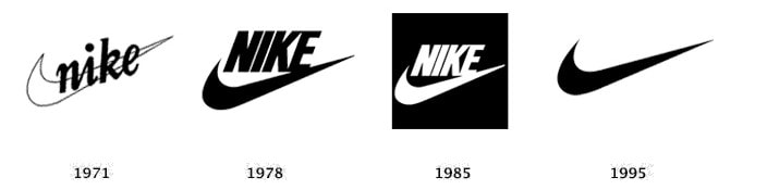
Evolution of a logo had passed a few stages before its design changed significantly:
Year 1971: “tick” was white with a black outline emphasizing the name in handwritten font. This design decision turned out to be not bad, but the text seemed to be lost due to a “swoosh” on products, it was difficult to read.
Year 1978: the name was now above the “swoosh”, it was more voluminous, and the font changed from handwritten to more symmetrical and strict. The tick itself was slightly stretched, so that it had a rounded shape.
Year 1985: the sign became red and white due to rebranding; the text became slightly wider due to the increased distance between the letters. Such a change brought an incredible success: this was the most memorable brand design.
Modern times: there are only two connected curves - “Swoosh”, the design and color of which changes. The company no longer needs to be introduced; now the sign itself evokes its name in the minds of customers. This decision was the most successful.
How would the Logo Look Like, if It Was Made with an Online-Generator
Online logo creation services are widespread and available to anyone who wants to try themselves at creating a unique logo. For example, the Logaster service is able to generate dozens of unique design options based on the name and field of the company, which you can edit to your taste, choosing the best.
With such a service, you don’t need to be able to draw or have design abilities: sometimes a creative look and understanding of the essence of the future shop are enough to create a sign that is not worse than Nike.
Conclusion
A good idea, the entrepreneurial spirit of the founder and a successful design made Nike recognizable among customers and the favorite of many celebrities around the world. "Swoosh" once again proves that simplicity and conciseness can often become the key to success for decades!
Latest articles
-

March 2025 Product Updates
By Cavan Koh · 9th Mar, 2025
-

How These Retailers Use UCX to Prepare for Ramadan—and Keep Customers Coming Back
By Frost Chen, Poh Sook Yan · 2nd Mar, 2025
-

1,000 SMEs to Benefit: EasyStore and Partners Sign MoU to Empower Unified Customer Experience (UCX) for Retail and Ecommerce
By EasyStore Press · 26th Feb, 2025
-

Let Business Help Business Supports Over 1000 Local SMEs Across Malaysia
By Amirul Asraf · 15th Feb, 2025
-
EasyStore Launches Brand App: A Game-Changer For Customer Experience
By Kelie Wong · 13th Feb, 2025
-

February 2025 Product Updates
By Cavan Koh · 9th Feb, 2025