The Perfect eCommerce Home Page: Here’s how to get it right on the first try!
By Téa from Moosend · 13th September, 2019

Brick-and-mortar stores are turning out to be a thing of the past with each passing day and eCommerce stores become more and more popular, no matter the niche.
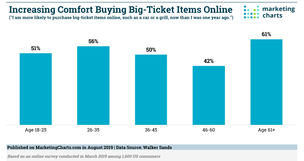
As a matter of fact, eCommerce has made consumers so comfortable with online purchases, that a quite large number of people states that they’d be more comfortable buying expensive items online than they were some years ago.
(Source)
The chart above clearly shows that even the not-that-tech-savvy Baby Boomers are not too fazed by online purchases anymore.
This is a clear indicator that eCommerce is here to stay. And if you’d like to take advantage of what appears to be more than just a fad in the trading world, then keep on reading, as it all comes down to the perfect first impression: Aka the home page.
Convey the message loud and clear
It’s not only that you’ve got practically zero seconds to make a good first impression. No matter your niche, there are going to be some (if not a lot of) competitors. Why should they have a full sales funnel and not you?
As a first step, you need to make prospects aware of your brand and its hows and whys by remaining true to your brand’s tone, which is, after all, what your target audience connects with in the first place.
Remember, prospects nowadays are not interested in purchasing products. Rather, they’re interested in purchasing solutions, something that will answer the “Why” question, as I’ve mentioned before: Why your brand?
The home page is the place to showcase anything and everything you need to showcase, when it comes to the company, by using clever design first and foremost. This is the “loud” part.
What about the “clear” part, though?
The homepage is not the place to over-analyze information about your brand and its specifics. Remember, the prospect on there is trying to understand why they should pick you over someone else, so the more they need to process, the higher the likelihood of them closing the page and looking for something else.
In the end, your message needs to be one and simple, that will gently nudge users in the right direction, rather than make them digest data on top of data.
Now, you’re gonna wonder: “But how am I going to do that if I can’t tell all?”
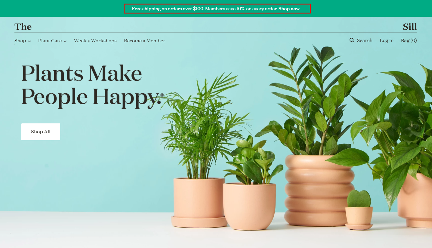
Here’s an example:
(Source)
This eCommerce store’s home page does exactly what I’m describing above. There’s a clear idea of what the brand’s cut out to be-in our case, we’ve got an eCommerce store that’s all about plants and gardening-and we can see the catchy design, clear CTAs that leave no visitor wondering what they can do on that website and the value is stated clearly: Free shipping and a members’ discount to boot.
Pro tip: See our top picks on the best eCommerce stores and what makes them special!
The main focus here lies in the actions a user is informed they could take: Everything is right there where a user needs it, which is important, as that way, the brand can grab those impulse buyers and actually get things done!
What can you get them?
A visitor should never wonder what this or that button do and should never be left looking around for those buttons needed. Be as simple as possible and make use of the basics and that alone, when creating those menu buttons.
Of course, you’ll need some links here and there, to help users navigate your website. But honestly, you need nothing apart from the classics like so:
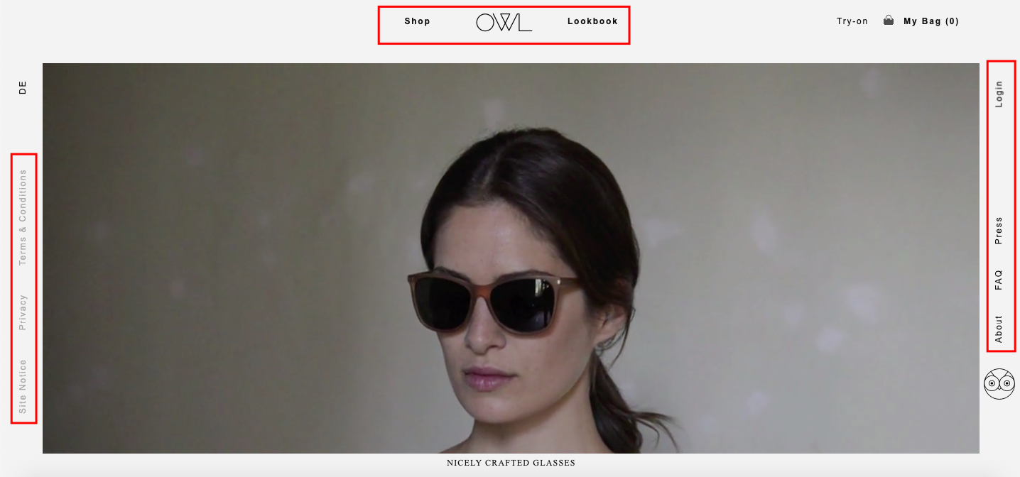
(Source)
Humans use an organizational memorization method called “chunking” wherein information is broken down into smaller mental units called “chunks”.
You see, there’s a huge risk to take with the links: The more they are, the higher the risk of a user getting confused, and the higher the risk of confusion, the higher the risk of just hitting the close button and getting on with their lives.
Too many links have another undesired side-effect: You could lead your prospects to anything but a purchase. Being redirected here and there, could lead your prospects to not actually checking out the product or how much money they save with your members’ discount, but reading your about page, which just happened to get in the way.
This is leaving money on the table. And as a brand, you have got to hate this.
What are they supposed to love?
I know, we’re talking about a homepage, but don’t tell me that you don’t find personalized recommendations to be useful and fun. If you decide to utilize personalized recommendations, I can bet that you’ll have a homepage that will increase conversions in your hands.
Just go ahead and collect visitor data through your cookies: location, age, interests, pages viewed, anything *grabby hands emoji*. That way, you’ll be able to not only make the right recommendations, but also appeal to first-time visitors and followers alike, right off the bat.
But let’s assume now that they’ve found something to love..
Some people (like me, shame on me!) use their shopping cart like a virtual inventory. Or, perhaps, some form of wishlist. Use your cookies to track those adds as well and know exactly what to suggest!
(I won’t get into cart abandonment emails at this stage, just remember that they’re a necessity.)
While I’m on the subject of the cart, one other thing I’d like you to remember: A shopping cart is a whole different world, and should be treated as such, in the sense that the user shouldn’t be looking around for it and they shouldn’t be unsure of how to configure it.
And please, make sure to notify users when they’ve got an item in their cart. Better yet, show them a number that will indicate the number of items in there.
Bit more on CTAs
If clever designs are the beacons that call people to enter, then the calls to action (CTAs) are the vehicles that lead prospects to become customers. Which is exactly what you want to do.
A CTA, like all vehicles, should be the most useful one, one that will just make you hop on with a stranger and ride to nowhere-no, not really. It should be something that the prospect won’t be able to miss, though. A small little thing that will stick with them, like Nike’s “Just do it!”.
What makes a CTA compelling, though? And how much is enough?
Here:
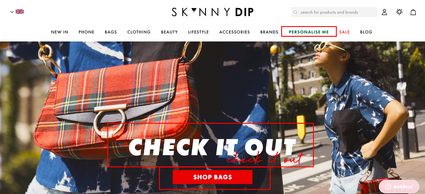
(Source)
We’ve got three CTAs, each one aiming to lead the prospect to a purchase, some way or another: “Check it out”, “Shop Bags” and the fantastic “Personalize Me”. Can you imagine the CRO each one of these will bring? Especially that last one...
Do these CTAs show the user what kind of actions they need to take later in a clear, concise manner? Yes, they do.
Moreover, the buttons are right there where they’re supposed to be and they leave nothing to the imagination-the user knows what to press, where and how.
The end goal is for the user to purchase and for the conversion rate to get higher, and the homepage does exactly that: Powerful imagery and clear CTAs are the way to do it.
How social are you?
Your homepage should give information on you and your product, that users shouldn’t look for. These bits and pieces of information should be right there where the user will see it. And with stats like that one:
(Source)
It’s clear as day that you should actually invest in social media buttons. Skip too much social media advertising, if it’s going to break the bank, and definitely invest in social proof instead. Which is exactly what your social media are here for.
If your page doesn’t have too many followers, your prospects will find this fishy, for sure, whether you’re up to something or not.
Hint: Try a social media management tool, if you feel swamped with social media!
But social media buttons won’t do the trick all on their own.
You can give a little something to your users, as a thank you for sharing your products or your website to social media. It could be a small discount, free shipping for certain orders of certain cost or even a sample-sized product.
Think of it as referral marketing-mainly because it is.
Go round and round
...Like a carousel! Carousel banners and dynamic design will allow you to showcase more products in less time.
Just make sure to do it cleverly, seeing as it’s way too easy for a user to filter out anything that looks and feels useless or sales-y. Or both.
Three categories with the main features, should be more than enough and the users should be able to go back and forth with carousel banners.
You’ll definitely need something like a play/pause button, just so that the user will be able to take a closer look.
Oh and on that play/pause button: It’ll need to be as clear as all the other buttons on your website. Don’t opt for a semi- or downright transparent design.
To sum up
It all comes down to these questions:
What do you want the visitor to do?
How can your visitor be lead to do what you want them to do?
What are the steps needed for the goal to be completed?
What steps are not needed?
If you decide on the answers, you can then go ahead and plan accordingly, as you’ll plan differently for a landing page, a page that needs to sell or a page that aims for subscribers.
So, there you go, these are my tips on how to create the perfect eCommerce home page that will convert exactly how you want it!
Author Bio:
Téa is a content writer working for email marketing software company Moosend and an obsessive writer in general. In her free time, she tries to find new ways to stuff more books in her bookcase and content ideas-and cats-to play with.
Latest articles
-

March 2025 Product Updates
By Cavan Koh · 9th Mar, 2025
-

How These Retailers Use UCX to Prepare for Ramadan—and Keep Customers Coming Back
By Frost Chen, Poh Sook Yan · 2nd Mar, 2025
-
1,000 SMEs to Benefit: EasyStore and Partners Sign MoU to Empower Unified Customer Experience (UCX) for Retail and Ecommerce
By EasyStore Press · 26th Feb, 2025
-

Let Business Help Business Supports Over 1000 Local SMEs Across Malaysia
By Amirul Asraf · 15th Feb, 2025
-
EasyStore Launches Brand App: A Game-Changer For Customer Experience
By Kelie Wong · 13th Feb, 2025
-

February 2025 Product Updates
By Cavan Koh · 9th Feb, 2025